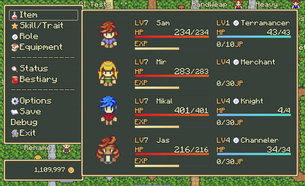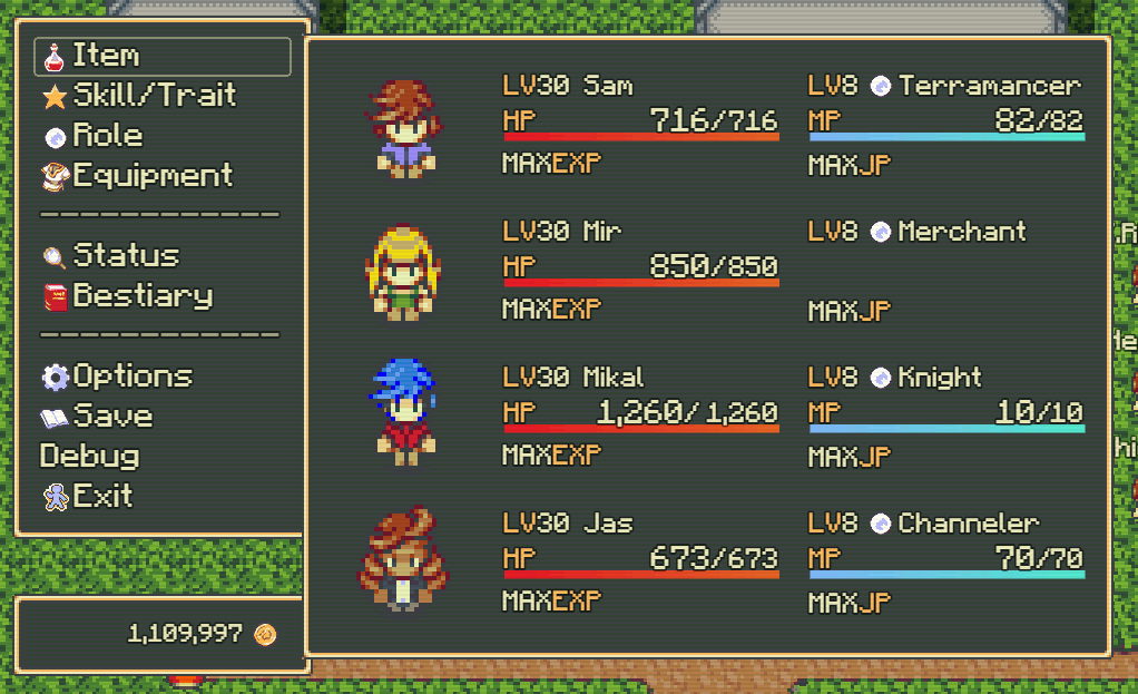
Full EXP and JP:

This new layout is very dense with information. But as someone who has spent many hours grinding in Final Fantasy 5, checking the menu to see my character’s current JP is very convenient.
I’m debating whether or not to keep the larger text for the current HP and MP. Technically it’s not very important to draw the player’s eye to these values, since they are refilled after each battle. I may put this layout into the battle UI, and change this menu to have a current-only value.