I bought and added two premium plugins to the project: Side Status Battle UI and Weakness Display.
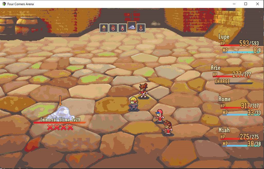
Together, they simplify the game’s battle interface. The re-positioned windows keep the player’s focus closer to the relevant actors.
- Actor’s actions appear right next to their sprite.
- Actor’s health and mana is located just to the right of them.
Targeting an actor will cause their status window to slide forward slightly. By a happy coincidence, their character portrait in the timeline display also bobs upward. It makes the interface feel cohesive.
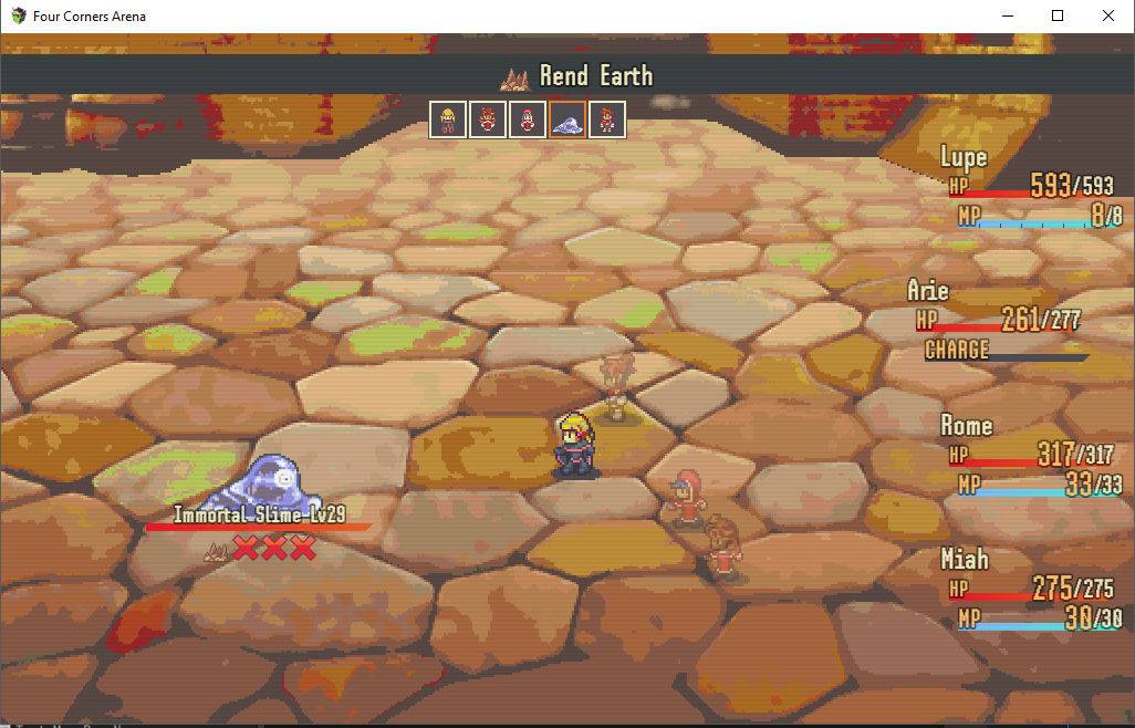
But it’s not flawless. As you can see, when the 4th party member chooses their action, their status is partially obscured.
An enemy’s name, health, and status ailments are shown when you target them.
The plugin also adds new functionality, showing an icon for each of the enemy’s potential weaknesses. Strike the weakness, and it’s revealed so you can remember for next time. Without this type of interface, enemy weaknesses are not signaled clearly enough to be viable.