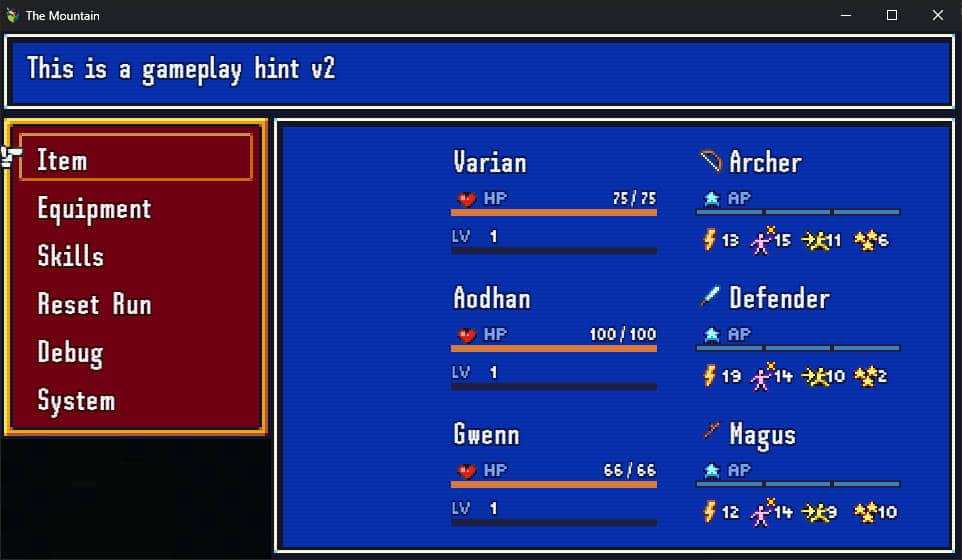
The menus in the game now feature 2 separate fonts:
- SH Pinscher for the large text.
- Munro Small for most numbers and small text.
Originally I went with this solution for technical reasons; resizing 1 font multiple times was either too ugly, or too costly in performance, depending on the implementation. So I chose different fonts for large and small text.
But it turned out to offer a better user experience as well. The separate fonts offer better visual separation. And using a font designed for small text gives it better clarity.
Tooltips
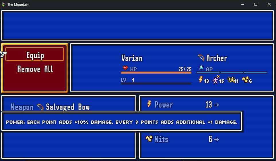
I also added pop-up tooltips when you mouse-over an icon.
The game only has 4 character stats, so it’s simplified compared to most RPGs that offer 6-10. But I haven’t been able to find a place to explain the benefits of each stat to the player, without dragging down the flow of the game. For now, tooltips are a good solution.